I wanted to do something fun when I graduated college. For the fortunate, this may look something like a trip to Hawaii or Mexico. My graduation, however, came right at the onset of the COVID-19 pandemic. Travel wasn’t an option, fortunately I still had a job. After some thought, I decided to invest in a split ergonomic keyboard. To be honest, I didn’t understand the rabbit hole I was crawling down; how many hours of customization, tweaking and experimentation I would spend.
There are a few things I prefer about split ergonomic keyboards compared to their regular, staggered alternatives. Firstly, typing with arms at shoulder-width is extremely comfortable. As a keyboard-driven computer user, the split ergonomics means I can rest my hands on the home row indefinitely. This setup also feels more natural. With a classic keyboard, leaving my hands close together for extended periods makes me feel sore and tense. Finally, as someone who has struggled with RSI in the past, my experience the split keyboard helps (although I understand this is an area of ongoing study). With that said, for me the most valuable part of these keyboards has been not the ergonomics, but the programmability.
In my mind, there have been two revolutions in the way I interact with the computer. One was learning VIM. The other was downloading custom firmware to a QMK-compatible keyboard. The standard, staggered keyboard is a general purpose tool. A product more of necessary evolution than decisive design. Their stagger, for instance, was intended to help typewriters avoid jams. Modifier keys (e.g., Alt, Ctrl) were placed after the fact, often in ergonomically convoluted positions. QMK allows you to create your own key mapping—tailored to your needs and preferences—without any special software running in the operating system. The firmware also supports layering; similar to using the shift key, but with arbitrary functionality. After trying several options, I eventually settled on the Moonlander, from the makers of the Ergodox EZ.
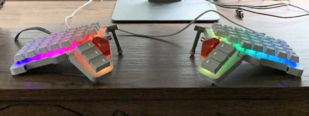
The Moonlander has an interesting, futuristic design. It’s fully backlit and able to tent: the keyboard folds in on itself. There are things I don’t like about it—the two red thumb-cluster keys are difficult to press and of a non-standard shape. The non-pictured wrist wrests, while neat looking, weren’t very practical; I ended up removing them.
The Moonlander’s keys aren’t staggered at all—instead, they’re arranged in a grid. Changing from a staggered keyboard to a columnar grid is pretty difficult. I was typing less than 40 WPM for weeks. The Moonlander offers one big advantage over similar ergonomic keyboards; on-board programmability.
It turns out, making a good keyboard layout is extremely difficult. Just getting something workable took me an entire season. When I explain this to people, many find it unintuitive. How difficult could moving around a few keybindings be? Making a layout with a particular use case in mind is simple. When you start trying to do other things, though, that’s when you run into issues. Modifier layouts that feel excellent in Adobe Premiere might be wildly uncomfortable in Firefox. Especially across OSs, some shortcuts are very difficult to press without careful modifier placement. After a year’s worth of experimentation and trial and error, here’s what I’ve come up with.
Layer 0: Base
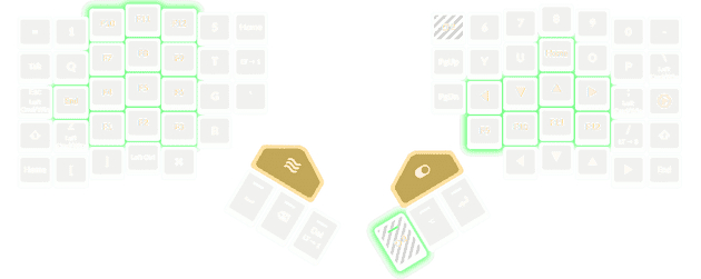
I knew when starting that easy access to all home, end, page up and page down were important to me.
As a programmer, I use these keys extensively when navigating and manipulating text.
Configuring the thumb clusters took a bit more experimentation.
I found I liked having space, backspace and delete right next to each other.
delete in particular is somewhat underused on a standard keyboard; the key is an integral part of my workflow.
I was initially a bit skeptical of arrow key placement. They’re arranged to emulate VIM’s HJKL-navigation keys, but are transposed one column over and two rows down. I worried that this would make regular VIM keybindings more difficult to use. Fortunately, I find the keys work quite well here. On a standard, numberpad keyboard, you have to move your entire hand just to hit an arrow key. With my Moonlander layout, navigation becomes a simple two layer-drop from the home resting position. Very easy to press. This also avoids the issue of over-reliance on the pinky or little finger with compact keyboards.
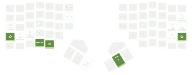
The command, control and alt keys were perhaps the most difficult to place.
One thing to note; on Windows and Linux, I use the MacOS command key interchangeably with control.
The functionality of these two keys is very similar.
When buying the Moonlander, I hoped to place command/ctrl on the right thumb cluster.
This would mirror the excellent placement of the key in MacOS.
There were a few problems with this idea, however.
One is that I found certain keys—namely t, r and e or y, u and i difficult to press with the middle thumb cluster key actuated.
Another is that I use command/ctrl extremely frequently when typing.
Shifting from hitting the the space key to command/ctrl was a distracting and unnecessary context switch. I don’t know why—it feels better on the standard Mac keyboard!
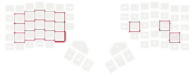
My solution for placing the command/ctrl key was to use QMK’s dual-key function feature.
Essentially, when a key assigned this functionality is tapped, one character will register (for example, ;).
When the key is held, it will act as command/ctrl instead.
There are some problems with this approach; if you’re typing normally the key will take marginally longer to register when pressed.
The firmware needs time to determine if the intention was a press or a hold.
In practice, however, I found that so long as this functionality was assigned to infrequently-used keys, the delay wasn’t noticeable.
I press command/ctrl so often, that for me, the best solution was to distribute the key all over they keyboard.
Typically, I alternate the modifier I press depending on the location of the accompanying keys.
For example, ctrl + a might result in the ; button being held (to produce ctrl), but I typically from ctrl + p with the z key being held.
Generally speaking, I don’t use alt alt as frequently used as command/ctrl.
In particular, it’s rare for me to press alt + y or alt + u, so alt may comfortably be used as a thumb-cluster-key.
Using software, I like to set up alt + (h, j, k, l) as my task switching hotkeys, which feels extremely natural.
Layer toggles were something I had to experiment with for a while to get right.
At one point, I had my layer 1 toggle where home is in this diagram.
This felt great, but over time began to cause pain.
I ended up transferring it to thumb cluster; tap-or-hold-functionality with delete felt natural.
Layer 1: Numberpad
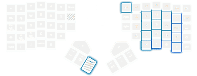
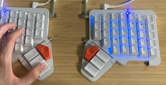
This layer, accessed by holding the delete key, mimics the numberpad found on a full-size keyboard. I typically type numbers via this method. For whatever reason, digit entry via numberpad feels much faster to me than using the top-row digits—even if I have to hold a modifier while doing it. I’ve experimented with adding special symbols to the left keypad, but generally found them unintuitive to press with the matching thumb-cluster-key.
One neat thing about the QMK firmware is that you can control RGB lighting contingent on the active layer.
This is very helpful when configuring new layers and learning where their keys are. And it just looks cool—especially if you’re rapidly switching layers!
Layer 2: Function Keys
As someone who spends much of my time in either Visual Studio or Visual Studio Code, the function layer is one I use extensively.
On a regular keyboard, I am ambivalent towards function keys.
They’re up a bit high to comfortably reach; you have to take your hands off the home row.
QMK’s layering features, makes using function keys a non-issue.
As these keys are numerically increasing, I find a numberpad-like format works well—similar to Layer 1.
Also on this layer are additional home and end keys, met to mirror the functionality of these characters in VIM.
Layer 3: Special Symbols
Using shift + a letter to form a capital letter just makes sense.
Using shift + 2 to form @ does not.
So why not put the special characters elsewhere?
Somewhere easier to reach from the home row?
That is exactly what this layer intends to accomplish.
In practice, I’ve found the results are somewhat of a mixed bag.
I absolutely use the layer to type %, &, $, &, * and ^.
I find these much faster to write via this method than by using shift + a digit key.
On the other hand, the natural position of ( ) is so deeply engrained in my mind
that I’ve never been able to retrain myself to use the layer—though I suspect it may be faster.
Taken together, the special symbols, function and digit layers make computer use feel much faster.
Where next?
I’ve never had much fascination with keyboard hardware. Even after a year, the main thing keeping me with this keyboard is the QMK firmware and the excellent Oryx app. With that said, I would like to try a different layer of keycaps. The Moonlander’s stock keycaps are perfectly flat; unscuplted, so that they may be re-arranged in different layouts (e.g., DVORAK). DCS keycaps, on the other hand, have a distinct and comfortable mold to them, giving your mind something to latch on to. I strongly prefer these. Image credits.
I would also, at some point, like to try the Kinesis Advantage 2. This keyboard isn’t a work of art in the way the Moonlander is, but the concavity looks extremely comfortable.
In the meantime, I’ll probably keep tweaking my QMK layout. It’s already good—but I think it can be even better. Like I said in the introduction, customized keyboards are a rabbit hole.
